A recent Forbes summary mentioned that 74% of customers value being “treated like a person, not a buyer”. This is why your brand’s experience must include personalisation.
Personalisation refers to tailoring your experiences to your audience’s unique characteristics, preferences and needs. In our previous blog post, we highlighted this key role of personalisation for every virtual experience.
Many tend to think that personalisation is expensive and must involve complex conceptualisations. But keeping it simple can do wonders too. We did just that in our latest project, the National Institute of Education’s (NIE) virtual learning centre.
Our experience strategists, UI/UX designers and programmers collaborated with the client’s team to bring NIE’s existing physical gallery into the virtual realm. Here’s how we did it with personalisation.
SIMPLE PERSONALISATION FOR A SEAMLESS EXPERIENCE

NIE’s primary audiences are trainee teachers, education researchers, policymakers and alumni. In other words: different groups, each with their own expectations. NIE envisioned a virtual space where local and international visitors alike could learn more about the institution. The client also wanted a convenient platform for prospective students to peruse NIE’s offerings. Hence, NIE’s requirements and their audience makeup guided our experience strategy.
STEP 1: AUDIENCE ANALYSIS AND STRATEGIC PERSONAS TO MEET CLIENT REQUIREMENTS
Our strategists carried out an audience analysis to know more about NIE’s audience segments and their interests. We then combed NIE’s materials and worked with the client to identify the most relevant content that different audience segments would be looking for.
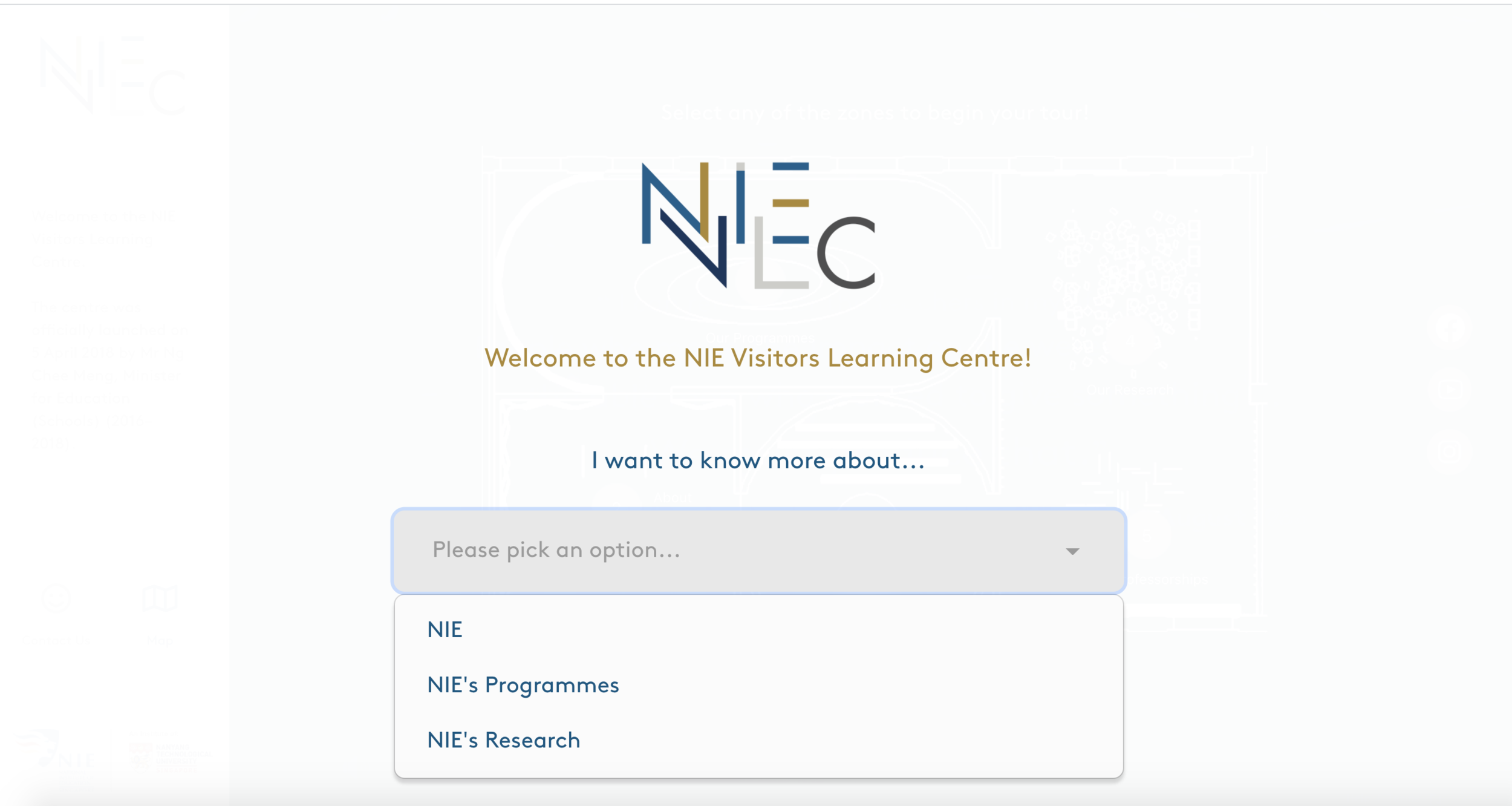
With NIE’s considerations in mind, we created three strategic personas – an aspiring teacher, a researcher and a member of the public (with focus on the NIE alumnus) – to personalise users’ journeys. We provided these options on the landing page. After each user chooses their area of interest, information within the experience will be tailored to it. This compensates for a shortcoming that physical experiences have, which is that visitors can get overwhelmed by the large quantity of information when they first enter the gallery. Since this interface can quickly meet users’ expectations, users will also feel that NIE understands their needs well.
STEP 2: INCORPORATING HOL’S STRENGTHS TO DIGITALISE THE PHYSICAL
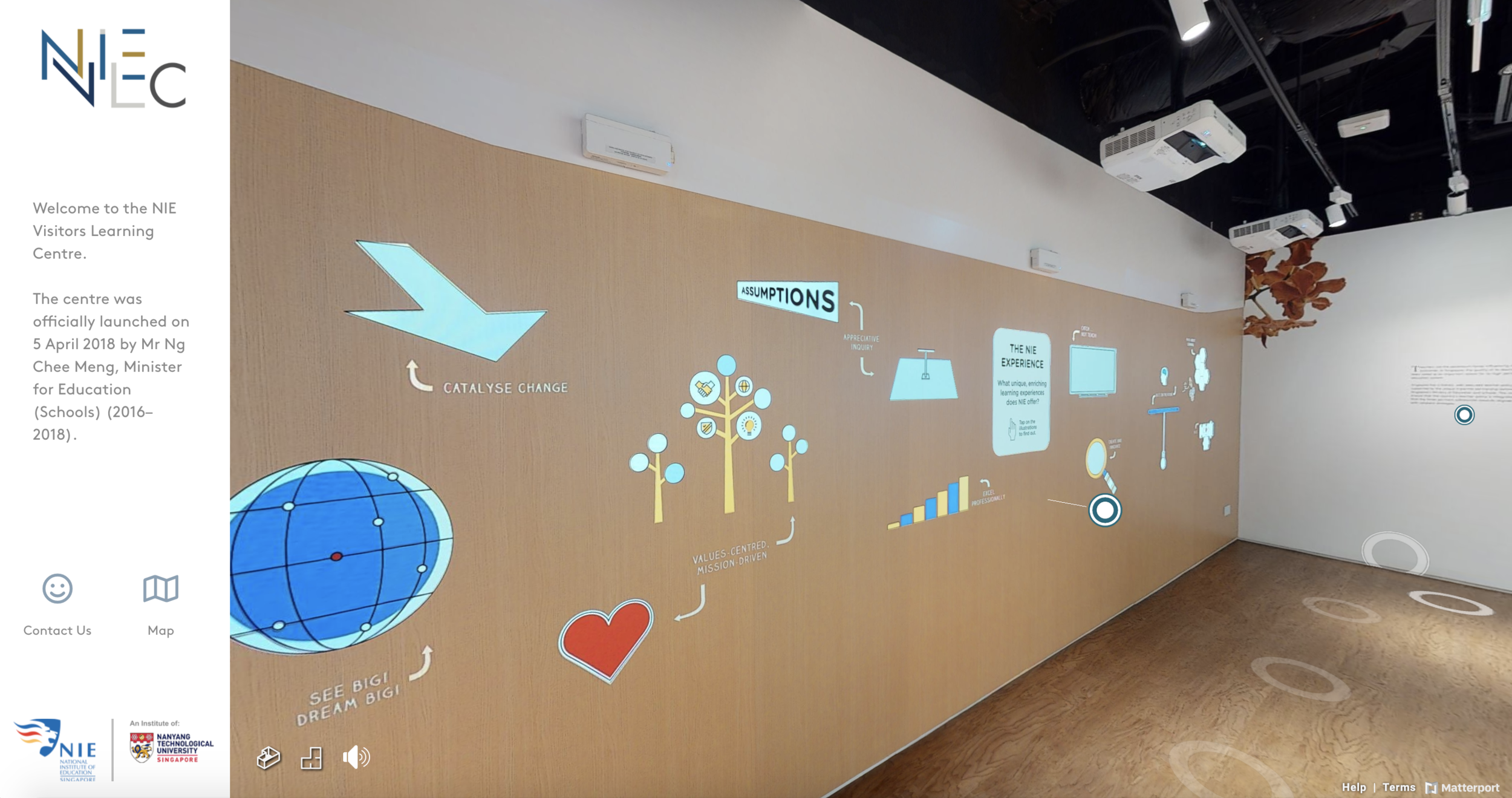
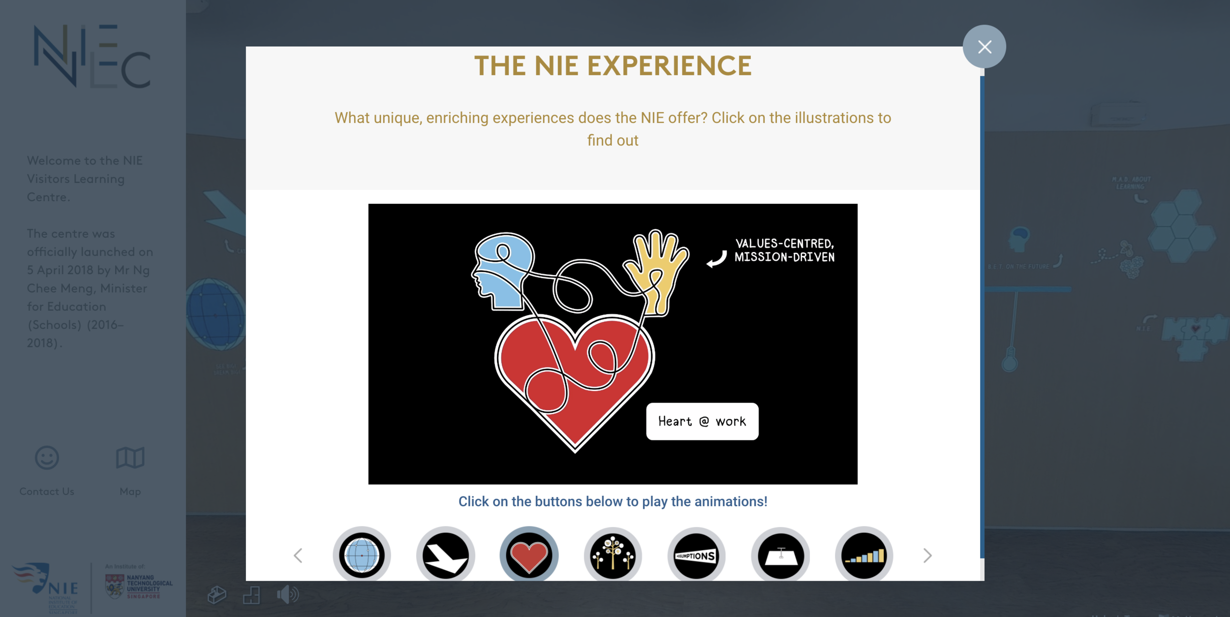
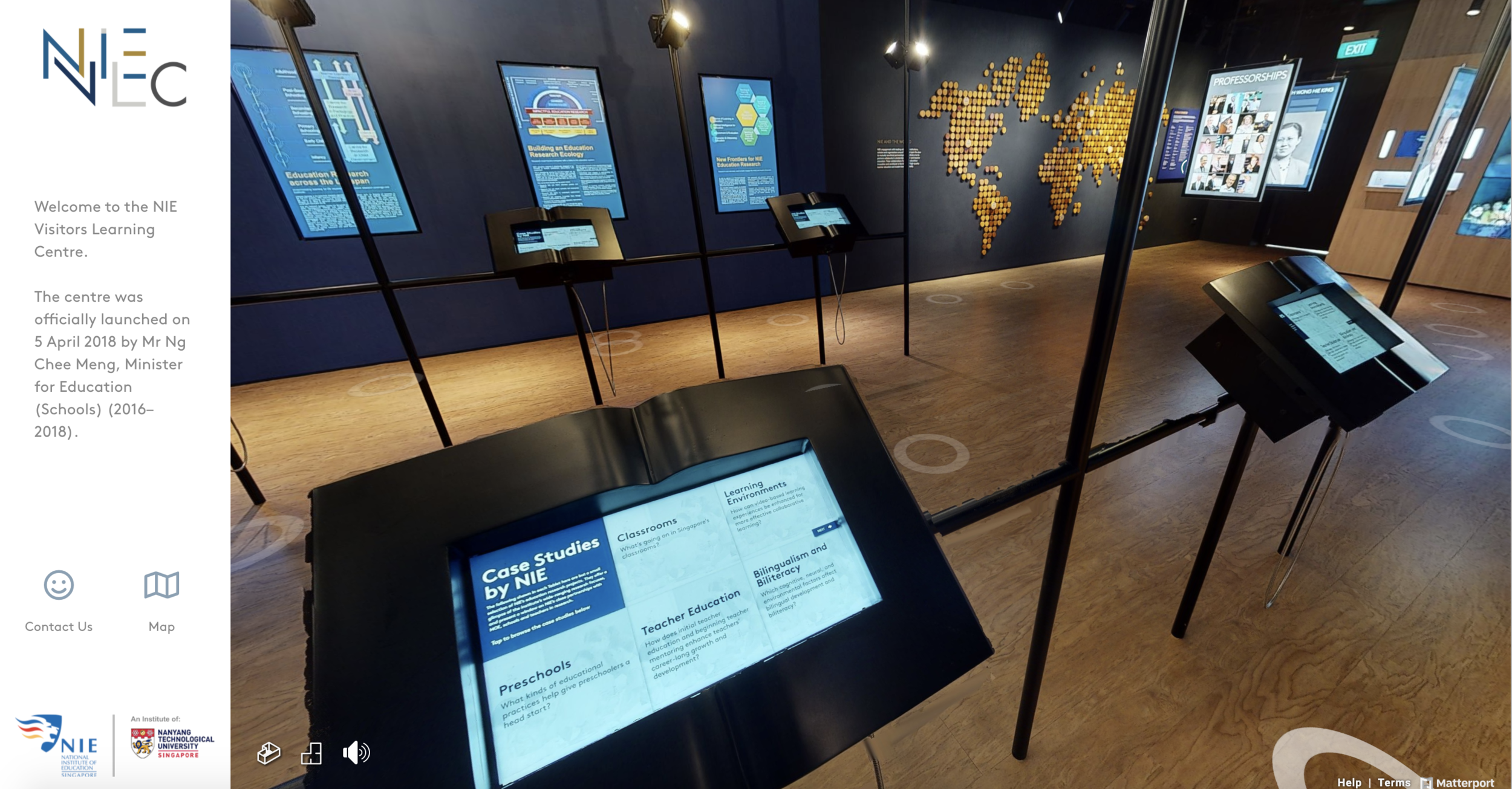
We also strove to emulate what walking through the gallery in person would feel like. This required translating real-life cues and ambience into a digital version, without undermining its functionality. To achieve this, we digitalised the physical interactive wall and research kiosks to realistically mimic the in-person experience.
STEP 3: TAILORING THE EXPERIENCE TO GIVE AUDIENCES A PERSONAL TOUCH
Audiences, on the other hand, want to feel special. How could we combine the priorities of the above stakeholders to make the experience more personal? This lies in personalisation with a purpose, which pervades the experience’s overall design down to the smallest details.
Default hotspots are static and generic. Experimenting with the software development kit (SDK) provided by the platform, our development team created customised overlays that reflected NIE’s sleek brand image.
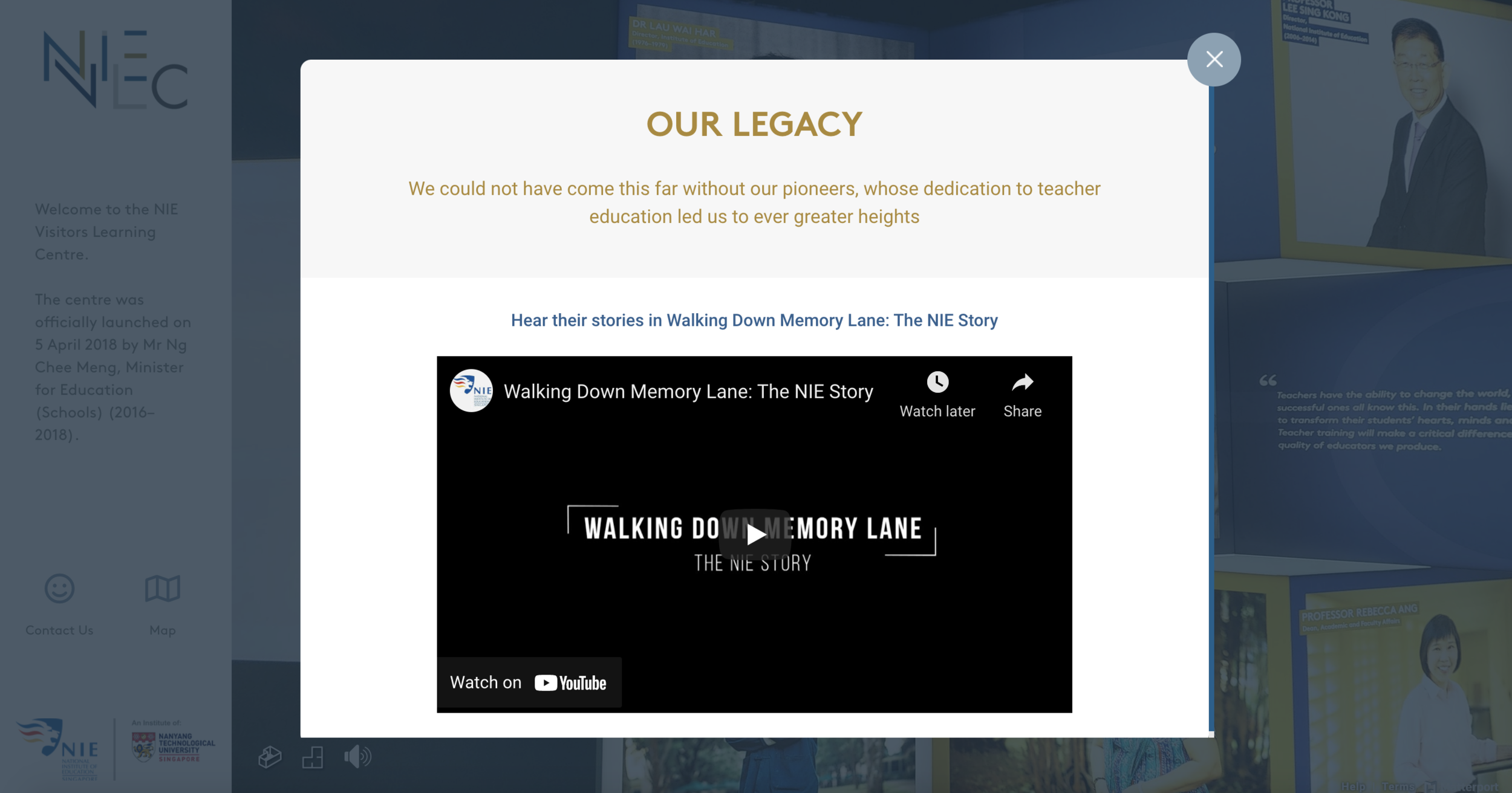
More importantly, the experience was also designed to be helpful and intuitive, such that users could smoothly explore any content of interest, minimising obstructions to the flow of the experience and quickly providing answers to what each persona is curious about.
For example, if users click on “NIE’s Research” on the landing page, the virtual Zone 4 will glow to get their attention. They can then direct themselves to Zone 4, which is about NIE’s research. Similarly, those who enter as general public and choose “NIE” will see Zone 1 (Introduction to NIE) light up while those who enter as potential students and choose “NIE’s programmes” will see Zone 3 (Programmes offered by NIE) light up instead. This demonstrates how personalisation can further uplift any virtual experience, no matter how simple it may be.
All these virtual features also boost the site’s interactivity and allow users to enjoy the same content (and more!) even though they are not there physically. Our virtual model thus underscores how you can breathe life into a virtual experience and keep to a budget even with off-the-shelf software.
SEEDING FUTURE IMPROVEMENTS THROUGH DATA
Data collection is also vital to every experience as insights gleaned can inform future projects. With such user information, NIE can perfect its audience-targeting strategies. In the future, they will also be able to connect more personally with the community. This means that their virtual experience will only get better.
Hence, to lay a solid foundation for NIE’s future personalisation endeavours, we coded data collection infrastructure within the site (while ensuring confidentiality of the data collected).
FINAL THOUGHTS
While our clients who choose to go virtual know the value of personalisation, most fear the complications and costs of implementation. However, the success of NIE VLC illustrates that both concerns can be managed well.
Here are some useful pointers to keep in mind before you embark on your personalisation journey:
- Needs vs. wants: What are the purposes of your personalisation features? Do they add value to your whole experience or are they just for show?
- Budget: Weigh the benefits of personalisation against your costs to decide the adequate amount of personalisation needed for your specific experience. If you are just starting out, you may want to keep your personalisation methods small and test the waters before fully diving in.
- Choosing the right partners: Work with good experience strategists who are capable of achieving what you want within your budget. They should also be forward-looking and help you plan for future improvements in your experience.
It is easy to feel daunted by the task of creating immersive virtual experiences as digitalisation and hybridisation start becoming the new norm. However, basic experiences done well with personalisation can make an equally big impact.
Prefer bite-sized insights into how to spruce up your virtual experience strategy? Check out HOL’s Instagram post for tips you can refer to on the go!

