Ever felt frustrated when you had to queue up for too long or do something boring? That’s exactly how your audience feel when they need to wait for service or go through numerous steps before getting to what they’re looking for.
What’s the impact of this frustration?
Your audience may find it hard to get the instant gratification they seek if they have to go through processes like queueing and doing surveys.
You risk losing your audience. A study by PwC has shown that at least 1 in 3 people will leave a brand after just one bad experience.
What if we told you there are ways to avoid the negativity and still follow the business processes you need? All you need are some magical micro-experiences. These are generally small-scale activations that people don’t normally expect in a “regular” experience. They may seem insignificant but can leave a lasting impact by enhancing your brand experience and delighting your audience.
Here’s how you can make your mundane and even unpleasant moments more magical and exciting.
#1: INCLUDE EYE-CATCHING MICRO-INTERACTIONS THAT SURPRISE OR HELP YOUR AUDIENCE
Ever skipped an ad on YouTube or skipped the intro to your Netflix TV show? Congratulations – you’ve engaged with a micro-interaction! Micro-interactions are minute and functional micro-experiences in many apps and websites to boost user experience.
Still not sure what constitutes a micro-interaction? Check out these examples below.
RememBear is a password managing app that allows users to unlock all their passwords with just one master password. Its bear mascot moves its gaze as users key in their password, signalling the length of what they’re keying in.
See how everything turns green at the end? That micro-interaction is also helpful as it lets users know they’ve keyed in the correct password.
RememBear’s bear mascot brings unexpected joy to users, who are tickled by this cheerful animation in an otherwise mundane login process.
National Heritage Board’s (NHB) Bras Basah.Bugis (BBB) Precinct Digital Map
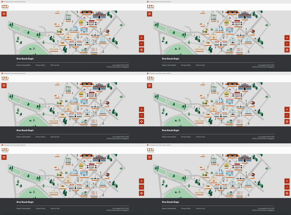
The BBB digital map HOL created for NHB also has simple micro-interactions to guide the uninitiated.
It’s natural to feel lost upon landing on a crowded map. So we let these icons pulsate at random to indicate that the BBB precinct map can be explored by clicking on any hotspot. These pulsating animations are subtle to avoid making the map look too overwhelming, which may deviate from its wayfinding purpose.
Even though most users will be navigating this map independently, we don’t leave them to their own devices. This micro-experience benefits users when they need it most but least expect it.
Mailchimp
We could all use some positive affirmation in our lives. Mailchimp provides its users with just that, using celebratory animations that pop up whenever one accomplishes a task. These animations are clearly no-frills, but they go a long way in recognising that Mailchimp users have done something successfully.
A simple nod to your user’s tiny accomplishment may seem insignificant, but it injects positivity into their day and might even make them smile when they think of your brand.
#2: INDULGE IN SOME GOOD OL’ FUN AND GAMES
There’s nothing like an engaging game to entertain your audience. Games have been proven to be beneficial to mental health, aiding stress relief. They come in handy to alleviate your audience’s tedium or boredom before they can accomplish what they need to do or what you want them to do. Just look at the fun and simple games below!
Google Chrome’s Dinosaur Game

This game for those without a working internet connection isn’t new, but it has long-lasting popularity. To this day, there are countless Reddit threads and YouTube videos dedicated to teaching others how to achieve the maximum score of 99,999. There are also websites allowing people to play the game even with a working internet connection. This simple game makes waiting much less annoying and more exciting and has enhanced Google Chrome’s branding.
The Char Kway Teow Legacy’s Healthcare Games
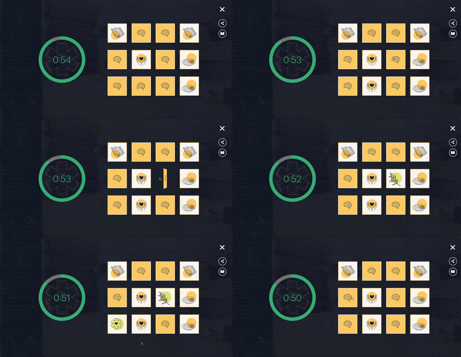
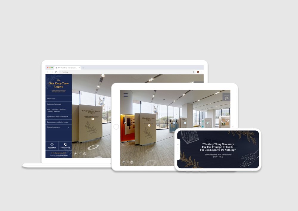
Simple games also allow your audience to engage with educational content in interactive and memorable ways. Remember The Char Kway Teow Legacy exhibition that HOL conceptualised for The GiveDangerously Foundation? We created some games, such as the flip card one above, to impart essential health information. Most of these games are short micro-experiences that don’t take more than a minute or two to complete. One user remarked that he was “in love with the interactives”, which kept him more “engaged” with the exhibition’s content.
Instead of making the audience learn the content through rote memory like other content-heavy exhibits, these easy-to-play games help them connect meaningfully with the narrative the foundation wanted to share.
Fortune City
Most personal finance apps involve a straightforward process of logging an entry each time you spend money. However, Fortune City makes financial planning – which is necessary and sometimes cumbersome – more engaging through gamification.
Gone are the days of monotonously tracking expenses line by line in a ledger and getting an unimaginative total. You can now build an entire town in Fortune City by logging entries, even on days you’ve spent nothing. Through the micro-experiences of watching your own town come to life, Fortune City incentivises the daily habit of tracking your finances and makes it fun.
While this is markedly more complex than the games above, Fortune City is a perfect example of how gamification can make routine chores feel less of a bore.
#3 ACTIVELY LISTENING AND RESPONDING TO YOUR AUDIENCE
With social media, people are extremely empowered to give feedback to businesses now. However, they don’t always get satisfactory responses, or they end up talking to chatbots, which many dislike and find annoying.
Instead of an autoreply or chatbot, try being like Sainsbury’s instead. Lily Robinson, a three-year-old girl, wrote to the grocery store asking why tiger bread had its name, even though the prints on the bread resembled a giraffe. Not only did Sainsbury’s reply to her, it even accepted her feedback and renamed the bread giraffe bread! The brand’s actions brought much warmth and won positive feedback from its other customers.
Negative reviews can be thorny issues for businesses. Whether or not the negative review is legitimate, you should engage tactfully with your audience and acknowledge their pain points, just like the example from a restaurant above. To go beyond this, you should also provide them with practical solutions that they could try.
Sometimes, even responding with a simple ‘thank you’ goes a long way. While some people take to social media just to express their opinions, they appreciate it when companies take the extra step to acknowledge their feedback and reply directly to it. Companies like HubSpot have done so to excellent customer satisfaction.
In these three instances above, taking the small but meaningful step of responding to your audience shows them that you’re not just listening but actively working on doing better. Letting them know they are more than just a number helps maintain a sense of community and retains your audience for the long run.
Final thoughts
As these examples have shown, you don’t have to drain your resources and jump through hoops to make things exciting. As with the micro-experiences above, every small action makes an impact.
Additionally, to make every micro-experience count, it is crucial to know your audience’s wants and needs. So conduct user research before you start conceptualising your magical moments.
Ultimately, by incorporating at least one of these three types of micro-experiences into your experience strategy, you’ll be able to transform the duller and unpleasant moments in your brand experience into something not just tolerable but magical and memorable for your audience.


