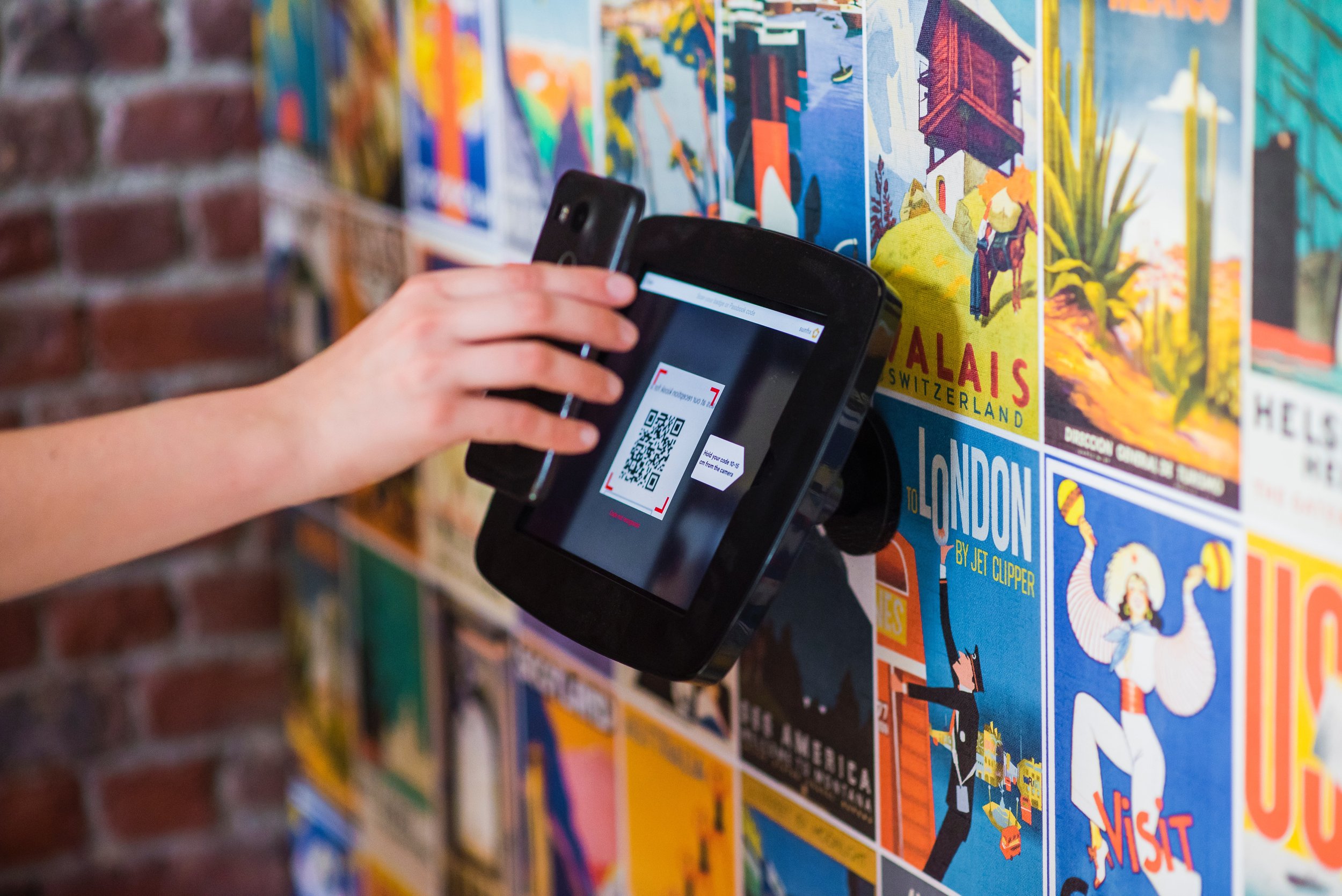
A good experiential space is visually interesting. It stops people in their tracks with arresting graphics and unusual displays and compels them to spend some time with it. But great experiential spaces achieve more than that.
Here’s what the best among them does and how you can create a successful experiential space.
#1 THE SPACE CONNECTS WITH THE AUDIENCE.
Some spaces have a specific target audience, while others reach out to people of all ages and demographics. If your space is the latter kind, your presentation should be thoughtful of its visitors across the spectrum. It can get a little tricky, but it’s doable. Among other things, you need to pitch the language at a level that will appeal to all visitor types. You need to use font types and sizes that make reading easy for everyone. Your content should be concise and easily digestible. And the presentation should help visitors connect your messages to their daily lives or past experiences.
#2 THE SPACE TELLS STORIES.
Facts and figures are essential, but stories are what really engage your audience. When your audience reads stories that evoke their empathy or inspire them, they’ll remember your content and messages. Human faces are the best ambassadors of your spaces.
#3 THE SPACE ENABLES DISCOVERIES AND INTERACTIONS.
Let your visitors explore your spaces through interactive elements. When people can touch, swipe, pull, hear, taste and smell, they make discoveries for themselves. This way, your content and messages will stick with them. And if your space can get families and friends to work and interact with one another, that’s even better, as these experiences make lasting memories.
#4 THE SPACE IS EASY TO NAVIGATE.
Good spatial design is integral to making a space successful. If you get it right, your visitors will move through the space intuitively without confusion or missing out on any components. They don’t have to “figure it out”. And that’s when your messages from the space are delivered across clearly.
#5 THE SPACE GIVES ITS AUDIENCE SOMETHING TO TAKE AWAY.
Your audience should walk away from your space with food for thought. Don’t leave them with the “so what?” question. Through your space design and content, help them connect to real-life phenomena or their everyday experiences. These connections can happen while they are on-site, or even months later.
At HOL, we’re guided by these attributes when we’re curating learning spaces. When you’re planning yours, be sure to keep them in mind too!


